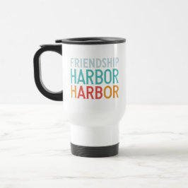
Friendship: A Safe Harbor
Typography:
* The font used is likely a sans-serif font with a modern and clean look.
* The text is layered with "Friendship" on top, "Harbor" in the middle, and "Harbor" repeated again at the bottom.
* The text is bold and uses a white color for contrast against the black background.
Color Palette:
* The background is black, providing a dark and moody atmosphere.
* The text uses a gradient of colors, starting with light blue for "Friendship," then turquoise for the first "Harbor," and finally orange for the second "Harbor."
* This color palette creates a sense of warmth and positivity.
Layout and Composition:
* The text is centered on the page, creating a sense of balance and symmetry.
* The layering of the text adds visual interest and depth to the design.
Overall Impression:
The design is simple yet impactful, with a focus on the typography and color palette. It conveys a message of friendship and community, with the layered text and gradient colors creating a sense of warmth and welcome.
1 ergebnisse
Tasse Friendship Harbor
Preis€ 23,70
Weitere Kollektionen von Art new design, die dir gefallen könnten
Zuletzt angesehene Produkte